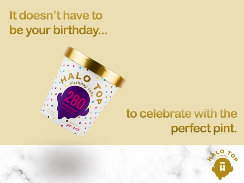
Hey there, readers! Welcome back. This week, we learned all about IMC (integrated marketing communications) and how important it is to maintain a strong, consistent brand. After learning the ins and outs of IMC, it was time for us to practice. We had to choose a brand that currently has a successful IMC campaign and try to create an image your favorite brand could use on the web. I decided to choose Halo Top Ice Cream because I believe they have very consistent branding, and I love the way they promote their brand on the web. It’s very simple, but fun and friendly! Here’s a photo of what I created:
Also, a quick side note: If you haven’t tried this ice cream, I really recommend it — it’s healthy and delicious!
In many of their photos online, Halo Top uses a white marble table to display their pints. They do fun things like put props on the containers or have them fly in the air (like the photo I created above). However, something they keep consistent is this marble looking table. Therefore, I thought it’d be a good idea to include this marble texture in my photo. I wasn’t exactly sure how to create a texture like this, so I Googled it and found a great blog post on how to do so. To create the marble, I created a rectangle using the shape tool and made sure I had the default colors selected. I then went to Filter > Render > Difference Clouds. I clicked this button a few times until I found a texture that I liked. Then, I went to Image > Adjustments > Equalize. After, I went to Image > Adjustments > Levels and played around with the sliders. I duplicated the layer, and went to Filter > Distort > Twirl and set the angle to 50 degrees. I rotated the top layer and blended the two layers by changing the mode to “Screen.” That’s how I created the marble texture! I added a beige color to the background, since that is what they use very often.
Next, I took a photo of their birthday cake flavored pint and added it to the photo. I decided I wanted to make it look like it’s flying in the air, since they do post photos like this very often on their social media accounts. A lot of their posts also focus on the pints themselves, so I thought it was a good idea to include the pint in the photo. I opened up the photo in a different document and selected it using the quick selection tool. I cut it from that document and pasted it onto my marble floor document. Then, I resized it and made it more slanted to make it look like it is flying in the air. To make it more realistic, I used the elliptical shape tool to create a dark oval under the pint. This was to make it look like there is a shadow on the table.
Next, I added the text. I decided to go with something that sounded fun and friendly, since their language is usually like this. They also use the phrase “perfect pint” many times in their messaging. Once I added the text, I made it the same color as the Halo Top on the ice cream pint. I wanted to make it look golden like the top, so I added a layer style to the text. I went to Layer > Layer Style > Bevel and Emboss to make the letters look gold. I adjusted the panels until I liked how it looked.
The final touch was to add the logo on the bottom right corner of the photo. There you have it! That is how I created this image.
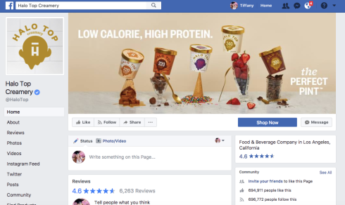
Just to show you how their branding looks, here are some photos and screenshots:
**Disclaimer: I am not affiliated with this brand in any way. This project is for educational purposes only.
